
I designed a nuanced, context-driven rating
interface that empowers film lovers to articulate “how” they enjoyed a movie, not just “how
much.”
SCROLL
why stars fall short
problem
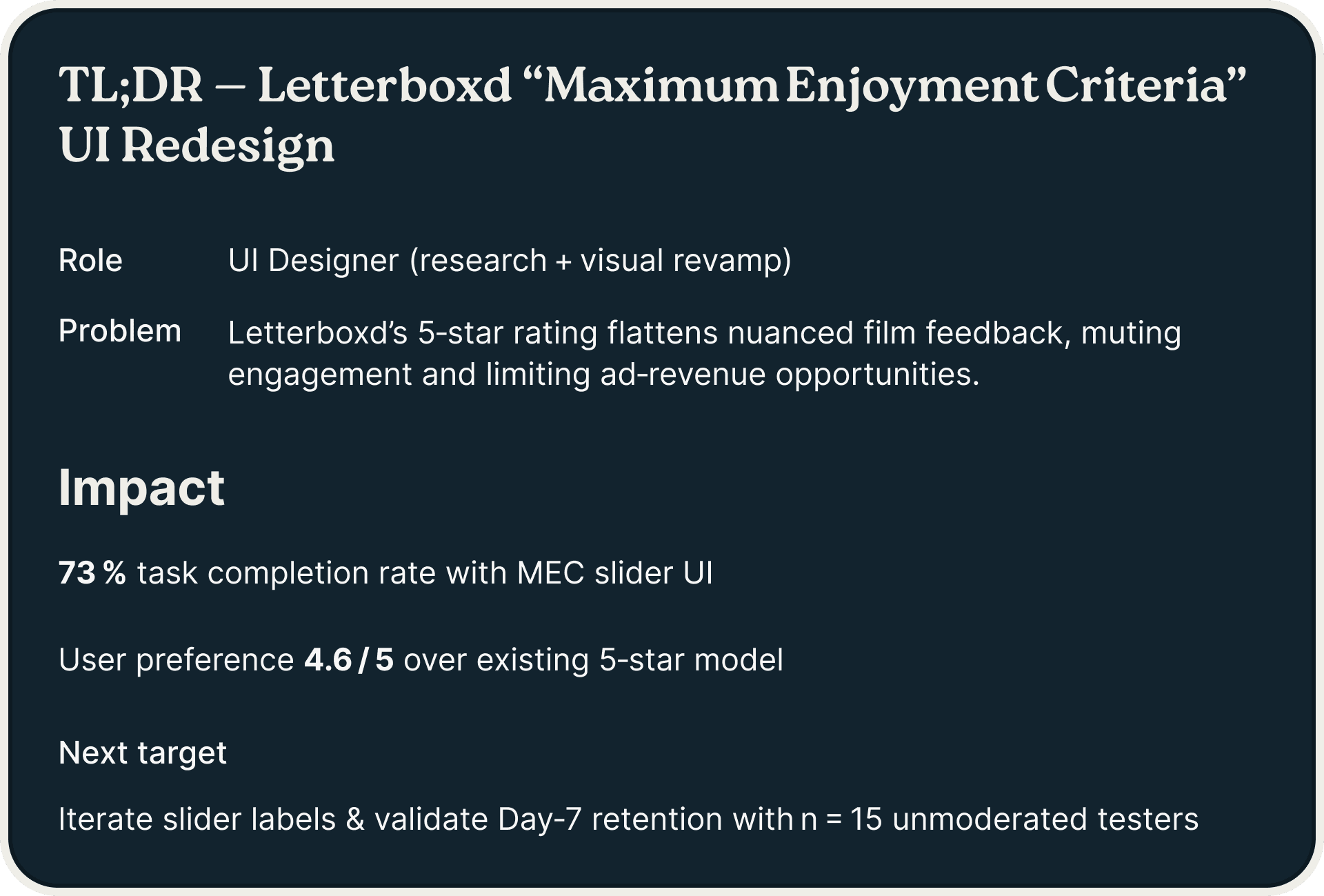
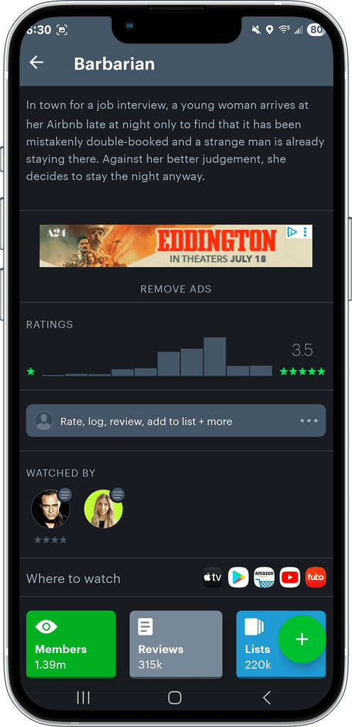
Letterboxd’s 5-star system forces all films—blockbusters, arthouse, documentary—into the same numeric mold, flattening rich viewer experiences into one number.

opportunity
Users craved nuance: the ability to share when, where, and why a film resonated. The Maximum Enjoyment Criteria project was born to solve that.
who we are
designing for
Meet Chloe, a 24-year-old content creator who watches films solo late at night then again with friends. She needs to convey mood, setting, and mindset of her film viewing experiences.


user flows


wireframes


I chose the ‘Midnight Reflection’ palette to evoke clarity, introspection, and carefully guided user focus
visual direction

style guide
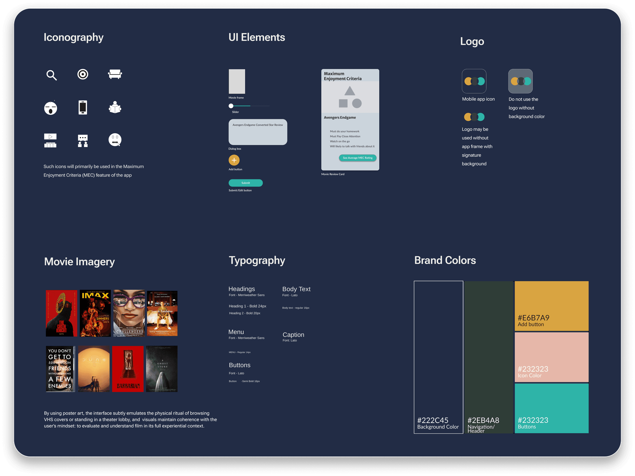
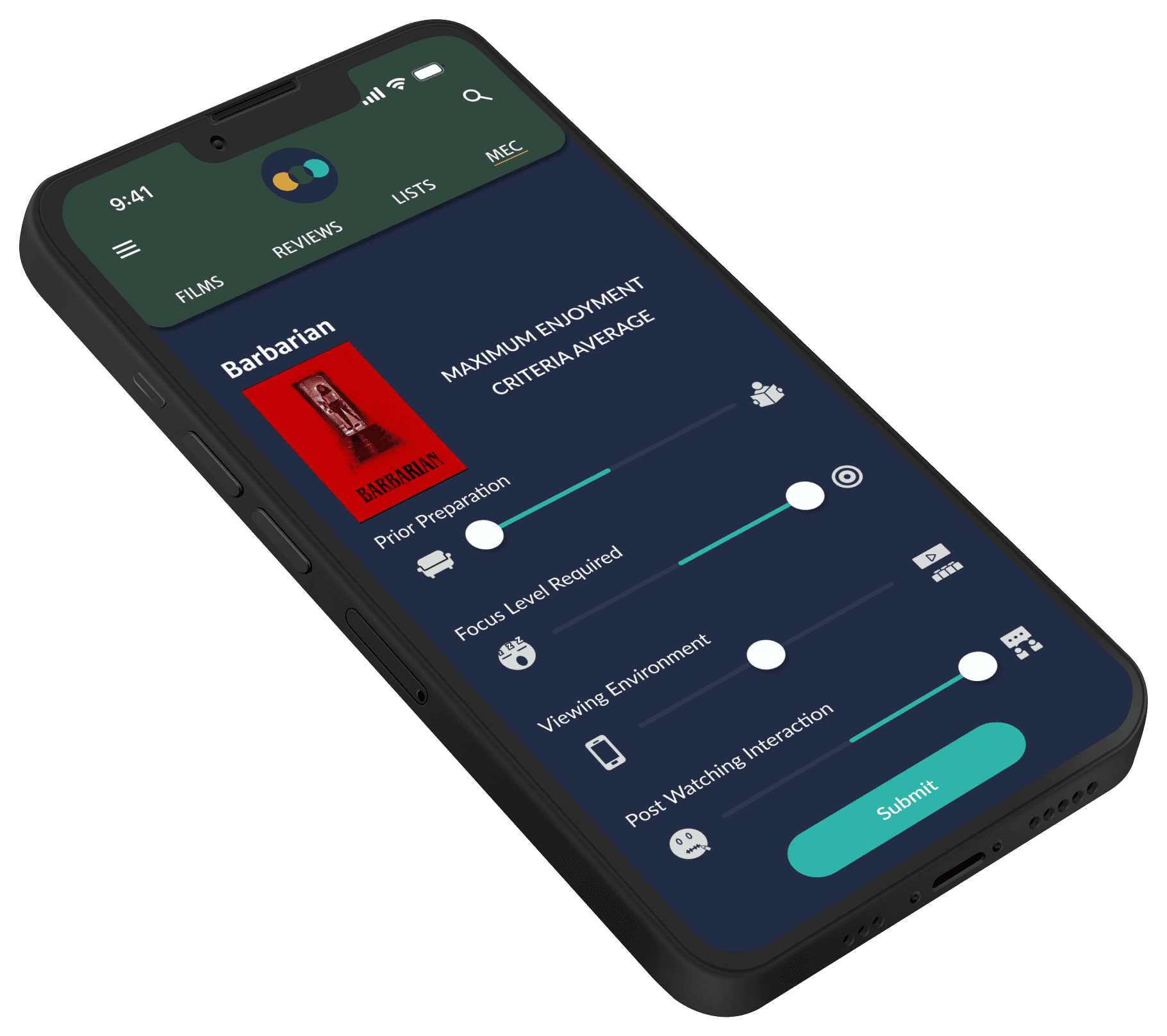
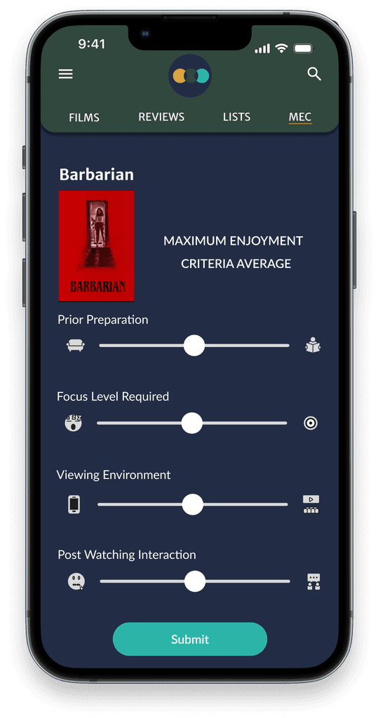
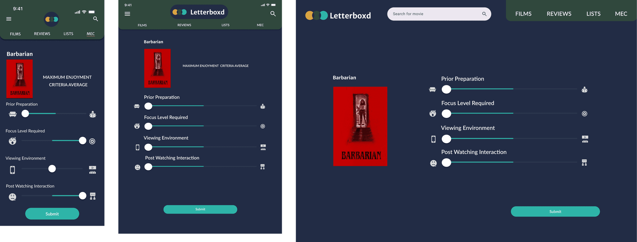
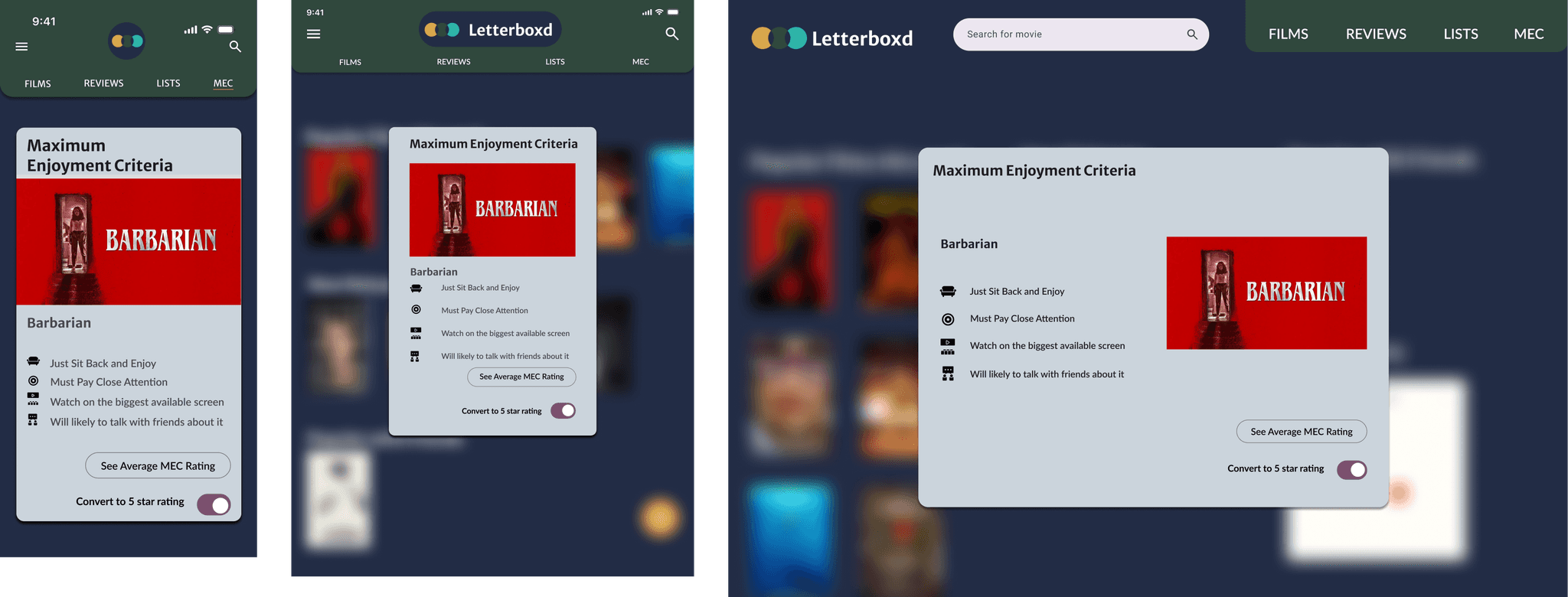
MEC sliders now let users pick anywhere on a continuum. Icons anchor each end— from mobile to theater for ‘Viewing Environment’

redesign

seamless across devices

reflections
I discovered that continuous slider scales deliver more nuance but can be hard to calibrate without user benchmarks. Next time, I’ll run a card‑sorting exercise to validate category endpoints before moving into high‑fidelity.
I learned the value of red‑lining screen specs in Figma and hosting a quick design-dev sync meeting to catch misalignments before sprint planning.
I was surprised how quickly users adapted to the MEC concept, however I would integrate interactive coach marks more broadly in future experiments to boost feature discoverability.