Live events

Industry
Architecture
Client
Implementto
Service
Date
February 2025
An emblem is a graphical mark, stamp, or emblem utilized to promote and encourage broad awareness and acceptance. It may present as a metaphorical or imaginative figure or include the term it represents, as illustrated in a logotype.
problem
Content creators and gig workers with multiple income streams need an e-wallet that helps them track earnings, set savings goals, and manage finances across platforms because existing solutions lack the necessary features, leading to financial disorganization and missed opportunities.
PlutoPay was designed to provide an intuitive, secure, and efficient way for users to track income, set savings goals, and streamline financial transaction.
how to better understand the user
User research will need to be conducted in the form of interviews, surveys, and competitor analysis to identify common frustrations and needs
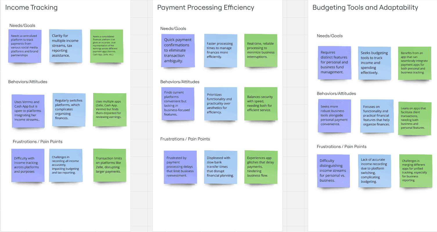
user insights
Centralization: All three interviewees expressed a need for a consolidated financial platform to manage income from multiple sources, improving efficiency.
Income Tracking: All participants need a better system for tracking income, especially across different apps, to simplify budgeting, financial reporting, and taxes.
Adaptability: Interviewees are open to adopting new tools if they offer improved features, integration with existing platforms, and security, as demonstrated by their current frustrations with available solutions.
who are we designing for?
sample plutopay user
sample plutopay user
how will this app be used?
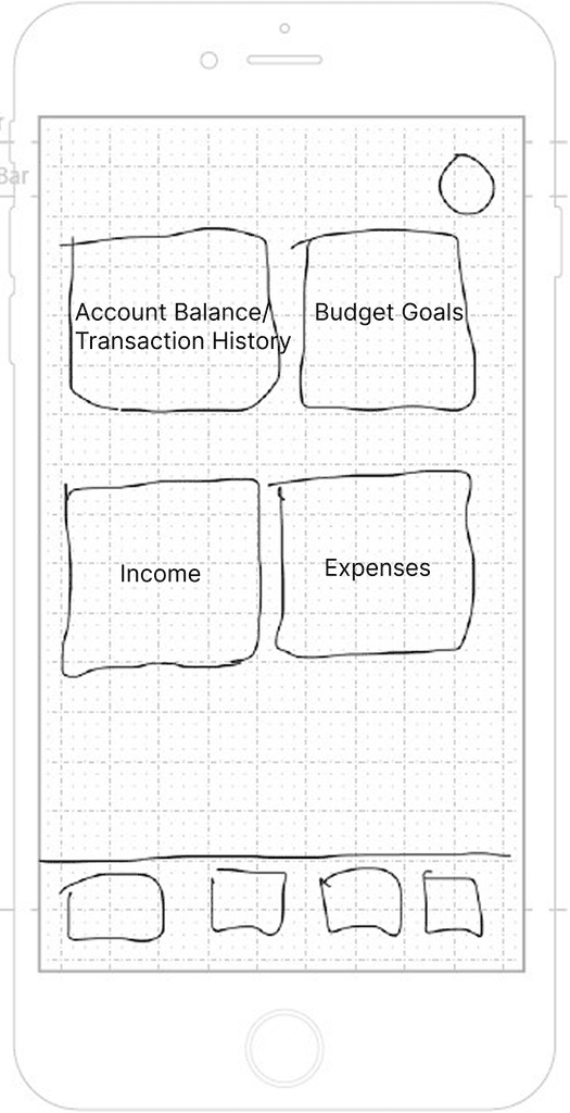
wireframes


prototype test plan
Test 6 participants in person with varying levels of familiarity with financial planning apps, including first-time users and experienced users.
Assess the intuitiveness of core workflows, identify usability barriers that hinder task completion, gather qualitative feedback to improve user-centered design decisions, and enhance the app’s value for key personas
Measure task success rate, time on task, error rate, satisfaction ratings, and qualitative observations via transcribed recordings, gather qualitative feedback to improve user-centered design decisions and enhance the app’s value for key personas.
insights from user testing
final mockup

icon stroke weight
Ensured consistent stroke weight across all icons to unify the final design.
logo
Mascot has been included to make routine tasks more enjoyable, reduce cognitive load and make the user experience more memorable.
modified buttons
Updated dashboard buttons to differientiate action-oriented language user flows. Changed "income” to “income sources” to address pain points discovered in user testing.